Selling products online is currently one of the most important emerging and thriving sectors of web marketing. It has expanded faster over the past years and is expected to keep growing at an accelerating rate. Ecommerce websites enable businesses to grow faster, more conveniently, and less costly.
There are an estimated 12 million to 24 million eCommerce websites throughout the world, with more being launched every day. Don’t worry if these figures make you assume it’s a competitive market. Only around 1 million of these websites sell more than $1,000 every year, so there’s plenty of space for expansion.
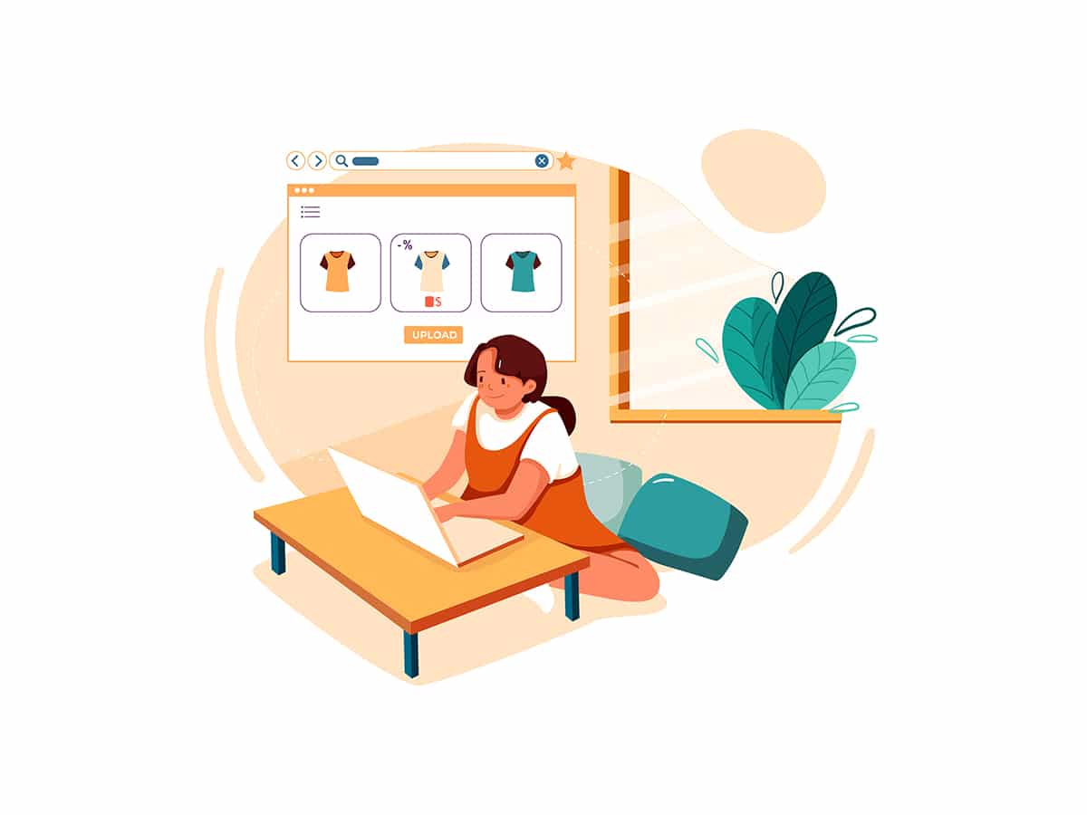
Whether you’re selling a piece of apparel or online courses, the way you present your items on your website may have a big impact on whether or not someone buys from you.
Let’s take a look at why you might need to update your eCommerce website this year, as well as some best practices to follow.
Table of Contents
Why You Need to Update Ecommerce Website in 2022
Most online vendors seem to be following Amazon’s and other mass retailers’ pattern these days, providing a few static (although high-quality) photos of the goods and a long description. The product page for companies selling electronic items such as Online business tools or a mobile app is likely to include a few screenshots demonstrating various use cases. While these methods aren’t fundamentally incorrect, they don’t help your items or website stand out among the other eCommerce sites.
The ability to present things in a unique and attractive manner might set you apart from the majority of unsuccessful online vendors. You’ll capture the attention of your target audience if you can present your items in a more interesting style, which will improve your brand awareness and make them far more likely to buy.
Read More: 10 Essential Features of an eCommerce store
1. Make images interactive.
If you can make a picture more dynamic and interactive, your product page will be significantly more interesting than if you use a typical, static image.
Cosmetics firms and renovation companies, for example, frequently employ photos with interactive sliders to show consumers “before” and “after” outcomes. Other websites utilize what are basically animated gifs to demonstrate how the product works.
Customers may be interested in seeing a 360-degree interactive view of a product, depending on its nature. You might also highlight clickable areas on a product picture. When a user clicks on a highlighted region, the website can offer a zoomed-in view of that aspect of the product, or emphasize a specific feature or advantage of the product.
Tools like ThingLink may make the process of making product photos more interactive a lot easier. This application not only lets marketers put clickable hotspots on product sites and other graphics, but it also keeps track of how much time people spend looking at them.
This can help you better understand which elements are the most appealing to your website visitors so you can plan accordingly when you design future interactive images.
2. Offer personalized product demos.
“Try before you buy” is an increasingly popular eCommerce concept in 2022, and for good cause. Many online customers are concerned about whether an item they purchase will live up to their expectations after it is delivered — and many do not. According to a Statista consumer survey from 2021, 25% of internet customers had returned a clothes order in the previous year.
Many buyers despise the difficulty of returning something, especially when the merchant does not offer free return postage. These bad experiences may cause a customer to avoid doing business with an online store in the future.
When selling software items online, similar challenges arise. Businesses are especially hesitant to invest in new technology if they do not perceive a clear advantage to their brand. While many Vendors provide product demos, they are often restricted in scope, failing to convey a complete picture of what a company can and cannot accomplish with the software.
For example, in the Online business arena, tools like Walnut may have a big influence on the purchasing experience. Brands may use this tool to create personalized demos for a variety of use cases and business sectors. The option to tailor processes for different features and substitute generic text or graphics with personalized or branded pieces can help sellers better understand the demands of their prospects while helping the demo user better understand the product’s actual application for their business.
For physical goods, the idea of “try before you buy” has become more widely expected thanks to the recent trends in online business.
Customers are given the option to “pay later” when they complete their order. When the item arrives, customers have one week to try it on and decide if they want to keep it. The package arrives with a prepaid return label so customers can quickly and easily return any unwanted items.
Whether the demo itself is physical or digital, these up close and personal trial experiences can help alleviate customer concerns and make them more likely to go through with a purchase.
3. Offer “build your own” orders.
While many customers appreciate the simplicity of one-click purchases, they aren’t the most engaging. It’s also not a viable alternative for several product categories.
Many websites have included the opportunity to “custom build” your fantasy version of their product, similar to how you would “custom build” your order in an ice cream parlor by selecting your flavor, cone type, and toppings.
Vehicle manufacturers, such as Volkswagen, are possibly the best example of this. Visitors who click on a certain Volkswagen model when looking for a new car may use the on-site customization tool to construct their “ideal” vehicle.
Visitors select a base model and then are walked through a series of build selections, such as engines, colors, interior, and additional options. They are also given the ability to compare their custom setup with the standard configuration.
While this in-depth process isn’t going to appeal to every buyer, the ability to test different options (including how they affect pricing) can keep customers engaged with a site for a much longer time. For the car buying experience specifically, giving users the ability to self-educate on different vehicle features can also eliminate the negative connotations of dealing with a car salesman who tries to up-sell buyers with unneeded features.
Best of all, the process ends by matching site visitors with nearby dealerships that have vehicles with their selected preferences.
When you give customers the ability to tailor their order (and online experience) to their own interests, you personalize the experience and drive conversions.
Read More: 8 Challenges of eCommerce Businesses in Nigeria
4. Show products in action with video.
Video has fast become one of the most desired ways to consume content on the web.
In fact, research has found that 73% of your website visitors are more likely to make a purchase after watching a product video.
Naturally, this means that video should be a central part of your online product marketing. Partnering with social media influencers to create video reviews or unboxing videos can be especially effective in reaching younger demographics.
However, not everyone who visits your site will have seen your social media content first. This means you need to integrate video directly onto your product pages.
Video content can be especially helpful for unique items that require more explanation than a standard hat or sweater. Alternatively, you could include a video testimonial where a current customer shows how they use your product in their daily life.
Incorporating video content doesn’t mean you should forgo adding text to your product pages. There will still be people who prefer to read a written description. But by adding an appealing video that provides a more in-depth explanation or a positive testimonial, you will increase understanding of what you have to offer and cater to the content preferences of everyone who visits your site.
While adding these creative and interactive elements to your product page requires more work than simply uploading a few images and a product description, the results are well worth it.
Creating High-Converting Webstore
By following the steps above, you’ll create an eCommerce website that is not only more interesting to your customers but also gets them to actively engage with your brand before they ever make a purchase. By turning something as simple as visiting a product page into a curated experience, your brand will make a far more powerful impression and be more likely to get those coveted conversions.


