The world of web design is always evolving. It’s no surprise that new web design trends, tools, and techniques are continually developing and changing as a discipline at the crossroads of creativity and technology — two sectors that move at the speed of light.
Designers have started creating sites as art, sites as interactive projects, and sites that simply exist for play and delight. This harkens back to the beginning of the web when designers found ways to show off new techniques or create websites for their own sake.
In today’s digital landscape, creative designing strategies remain effective in growing your customer base. With the right website, you can create an online presence that makes your business stand out in the competition and drive sales.
First impression matters.
As custom website design trends and cutting-edge software development continue to promote opinionated business branding, the field of web design continues to flourish.
With this article, you can understand the web design forecasts for the coming years and leverage them for successful business outcomes.
Table of Contents
What are the Main Elements of Website Design?
Website design is the process of planning, organizing, and arranging content and ideas online. Core web designing is not only about the visual appeal; instead, it is more about functionality. The intention is to present content on electronic web pages so the end-users can access it when needed.
The visual key elements of website design are as follows –
- The Layout: The developers arrange texts, graphics, and ads for customers to find all information they are seeking. Maintaining integrity in design, balance, and consistency is necessary.
- Fonts: The choice of fonts enhances the efficiency of website design. Its combination with color, scheme, image, and graphics decides the overall website tone.
- Colour: The proper color selection depends on the website’s purpose and clientele. Ensure to consider the color psychology, as it complements web design and conveys an ideal brand message.
- Graphics: Graphics include photos, logo, icons, and clipart. It should be made user-friendly at par with the website’s font and color implementation.
- Spacing: Proper incorporation of spacing makes your website look organized and easily navigable. It critically balances the text, graphics, and photo. Modern web designers prioritize whitespace to a significant extent.
- Content: Create optimized website content that is relevant, informative, and understandable. Incorporate the correct keywords and align them with your brand quotient.
5 Key Web Design Trends
There are some features of web design that will never go out of style — user-friendly navigation, data security, and quick load times should all be standard on your site. With new SEO practices and technological advancement, online websites have become the pulse of every business.
Subtle innovations in design are paving the way for the next big thing to become larger than yet another mainstream norm.
1. Mirco Interactive Web Design
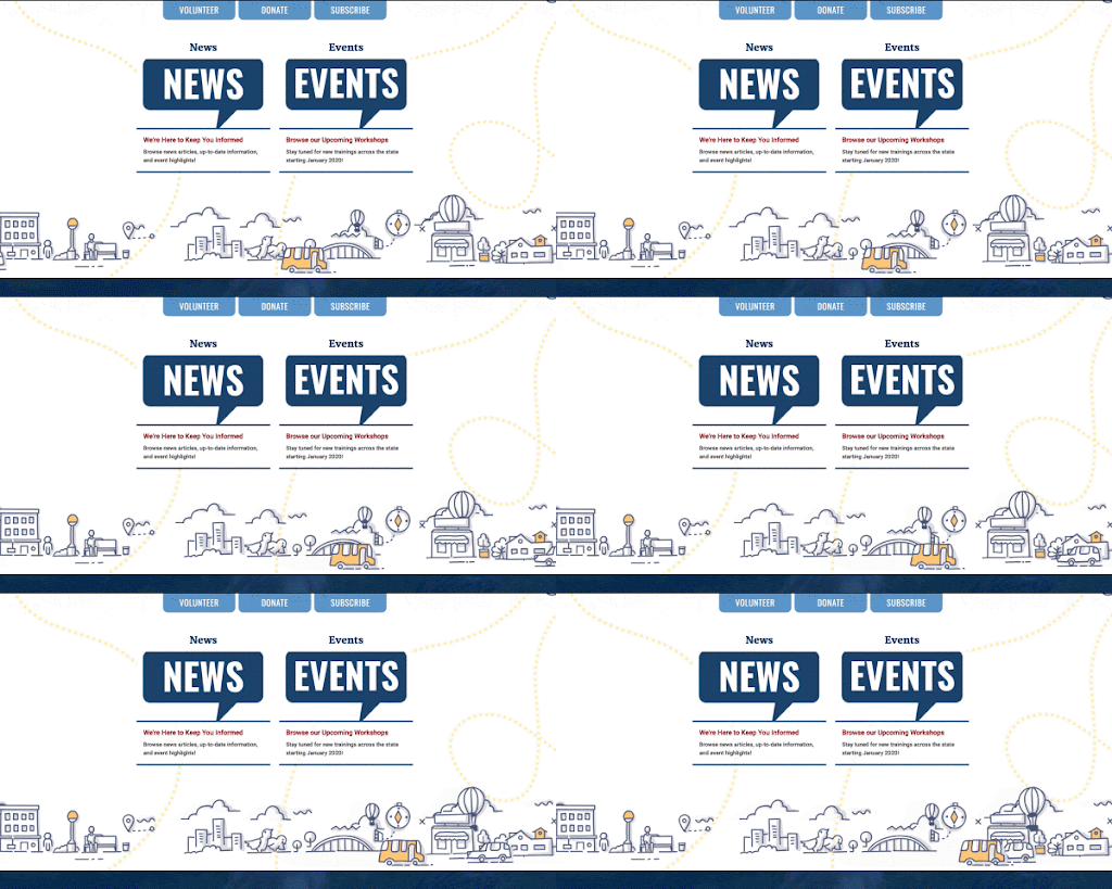
When it comes to animation in interactive web design, the small movements are what really sell it. And when you consider that the purpose of a website’s animation is often feedback (like letting the user know what they can and can’t interact with or whether they’ve done the right thing), it makes sense that this feedback works best on a subconscious level.
Animations that draw too much attention to themselves can be distracting to the user, overshadowing whatever feedback they were meant to impart in order to show off the animator’s skill. This is where micro-interactions come in.
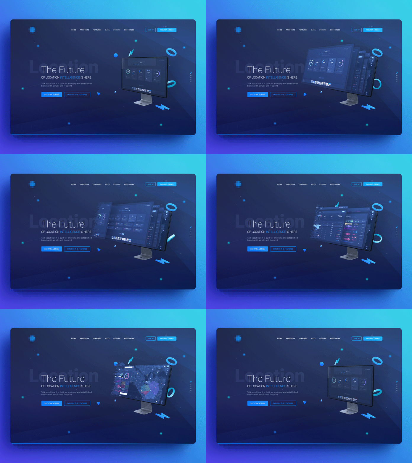
While small animations are nothing new to web design, we expect this trend to increase in 2022. Subtle movements bring a website to life, which in turn can give visitors a more interesting experience. These micro animations and designs can also be a great tool to emphasize important areas of a page and direct the user’s attention accordingly.
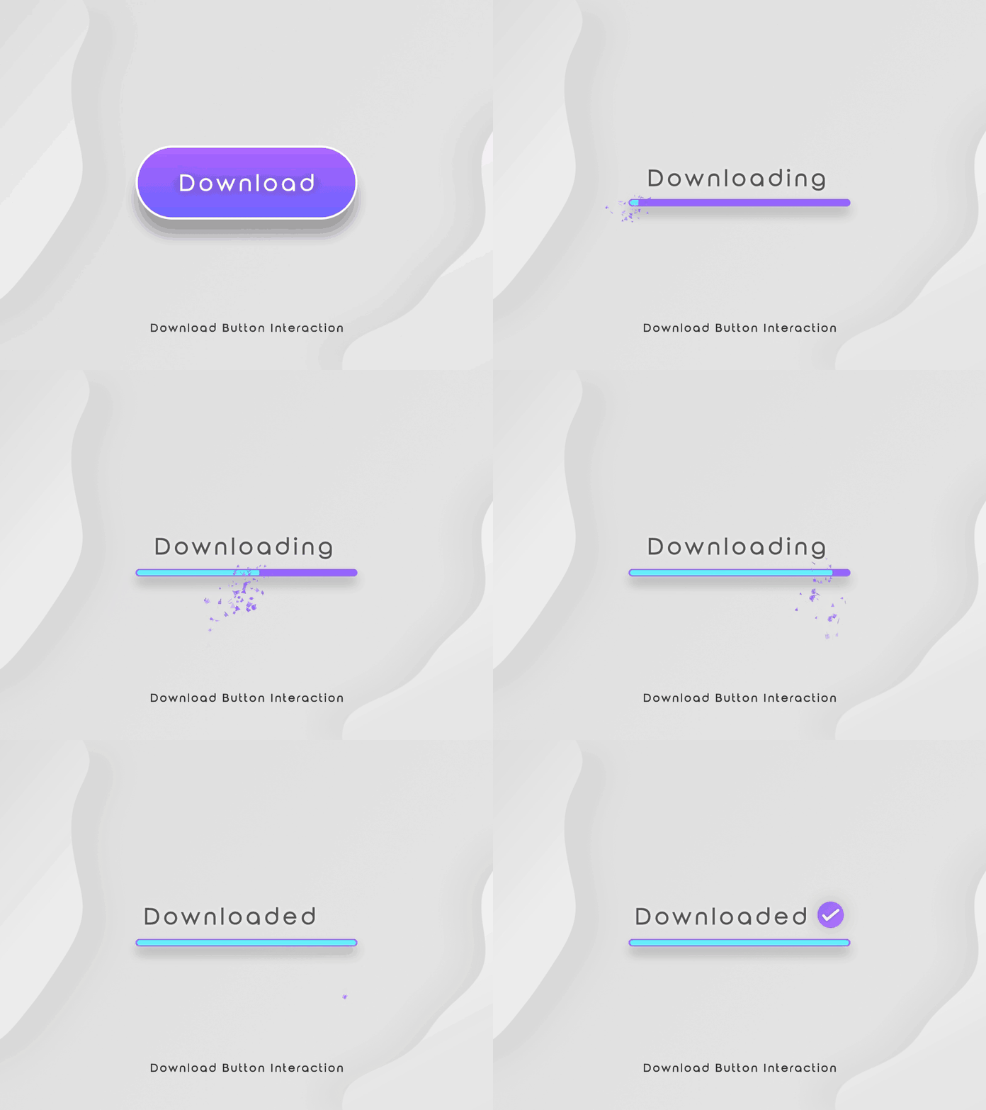
Micro-interactions are a wide term that describes all of the little ways in which a user might engage with a website. Hovering over something, closing a window, pushing to refresh, and clicking symbols like star ratings, bookmarks, notification bells, or add to cart are all instances of micro-interactions.
Turning a button green, changing an icon into a checkmark, or an outgoing circle that accompanies a click like a cute, infant shockwave are all common approaches for animating micro-interactions. The objective is to inform the user that they’ve made a successful update to the page, and micro-interactions should be straightforward and gratifying in order to do this.
At the end of the day, interactive web design is what the internet was made for. Out of the many reasons a visitor might have to check out a website, they are ultimately there to interact, not just to find the information they need but to experience it. This is why a website that fails to capitalize on these interactions can easily get lost in competition. The tips we’ve provided here are a great place to start to make sure this doesn’t happen.
2. Dark Mode Web Design
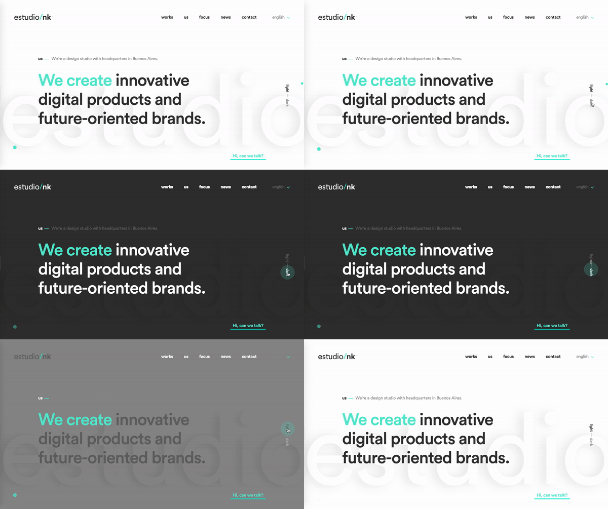
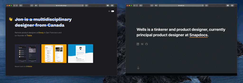
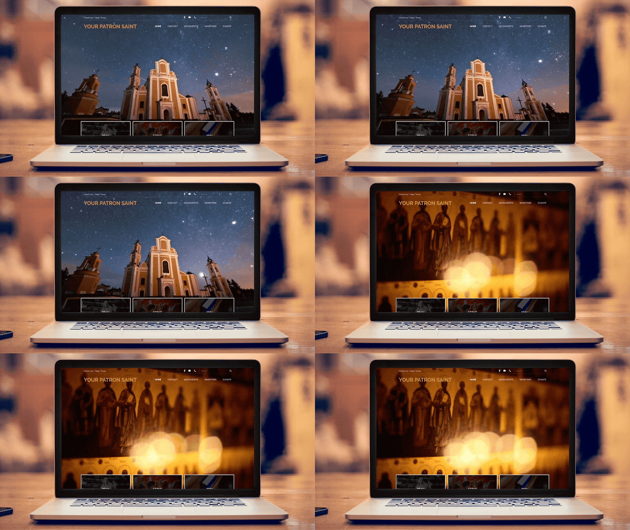
Dark mode web designs serve a couple of different functions. On the practical end, they help reduce eye strain, a concern for many as we are spending more and more time looking at screens. On the aesthetic end, dark mode easily creates an ultra-modern look for your website while giving you the ability to highlight other design elements just by darkening the elements that surround it.
Some companies are beginning to offer dark mode versions of their website, and we believe this website design trend will continue to grow in 2022. Dark mode, night shift, and other low light user interface options provide users with a low-contrast site or app that is easier to look at in low light environments.
The popularity of the dark theme has gained significant momentum. While most apps like Facebook, Instagram, Twitter have shifted to this interface, the e-commerce business websites are likely to adopt it in the coming years.
We believe the popularity of dark mode toggle switches on websites could lead to more black and white web designs in 2022. The dark theme lets you obtain many positive aspects during website designing.
- Create accent colors and highlight due to contrasts
- Perceive the entire content at lower levels of brightness
- Low energy consumption extending the life of your laptop screen
- Less stressful and soothing for eyes
3. Increased focus on UX/UI
Modern web design trends focused on humans in 2020, and this will become even more important in 2022.
Your site’s User Experience (UX) must be smooth, uninterrupted, and engaging in 2022. This means:
- Fast page load
- Little clutter (use that white space!)
- Scannable, relevant SEO content
- Multimedia
Web designers wrap functionality with creativity to create a great UX, leaning into clean design while still being creative and unique in all the right ways. The top web designers throw a bit of untidiness into the white, sterile world of technology.
Hand in hand with UX, your site’s user interface (UI) must be intuitive in 2022. This means:
- Voice-enabled interfaces
- Image captions
- Video transcriptions
- No distracting elements
- Balanced motion design
Level up your site’s UX/UI by:
- Providing visitors with easy-to-read content and easy-to-use interfaces
- Hitting their aesthetic sweet tooth
It’s also important to note that mobile surfing will get bigger. More than 50% of Internet traffic comes from mobile devices, and that number is expected to rise.
For a website to have a successful modern web design in 2022, all of its elements need to translate flawlessly to both desktop and mobile. Mobile responsive animation and videography will become increasingly important for modern web design.
4. Embedded Videos for Engaging Homepages
Using a video on your website homepage is one of the best web design trends for 2022. Video (especially in the time we live in now), is the way many of the world’s population consumes content: YouTube has over a billion users, and more than 500 million hours of video are watched daily on the platform.
By adding a video to your homepage, you have the opportunity to create a visual-first impression of the services you offer, who you work best with, and overall, show off what your company does to a prospective client.
Not only is video the preferred medium of the majority of internet users, but it can also shorten your sales cycle, and allow your sales team to have more informed and productive conversations with potential customers.
It only makes sense that you harness this power on your homepage.
5. Voice Functioning
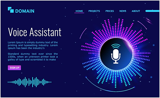
In the digital world, significant innovations seem to change how we all use the internet, voice search may be a commonplace element in website design. The voice-activated internet interfaces can allow swift website communication, promptly fulfilling customer demands.
As voice search technology has leaped forward in recent years, the way many of us search online is changing. You can specify your requirement without waiting for a longer response time. The effective implementation of contactless navigation will, therefore, make it fun and engaging.
Take Your Web Design to the Next Level
The field of website design is never predictable, and this is what makes it exciting. The top forecasted trends for 2022 can make you realize its dynamic influence in shaping human lives.
While the designers continue to bring website inclusivity, you can discover other design aspects that may likely drive website development in the coming years.
If your business is ready to take your web design to new heights, reach out to us to take your design and website to new heights! Contact Think Digiads today.


