Running an online store requires an eCommerce website. However, having one with all of the necessary eCommerce features is also necessary to succeed. A good eCommerce website will provide the client and the merchant with all of the tools they need to complete a successful transaction.
You can establish your brand, interact with more people, and sell your goods with an e-commerce store. It also allows consumers to check out your products and shop for them from anywhere and at any time, unlike a traditional store, because an e-commerce business is always open.
As a result, having the option for consumers to buy your products straight from your online store might be crucial in ensuring that you don’t lose out to competitors who already do.
However, creating an e-commerce business that attracts visitors and converts them into paying clients is challenging.
In this article we will discuss 10 essential features that your e-commerce store should have that will make it stand out if you already have one or you are planning to build one.
Table of Contents
Essential Feature of an e-Commerc Store
Although there are no universal features or design alternatives that will ensure your online store’s success, there are a few common requirements and even desired aspects that should not be overlooked when developing an online store.
1. Clear logo
A clear and remarkable logo is a business card for both startup shops and branded stores. When it comes to online shopping, a recognizable logo is is a reassuring symbol and an element of trust of the company or organization.
The more popular brands can afford to create an online store with a fashionable home page displaying minimum features. A well-known logo or a beautiful image, or video and the ‘Buy’ button will suffice for such designs.
2. Deals, Freebies and Free shipping
People usually decide very quickly whether they like a website or not; that’s why you should grab their interest in a matter of seconds upon their entry to the site; otherwise, they will just find some other shop with a more attractive home page.
Nothing attracts better and faster than shopping deals. Millions of people lose their minds during sales and discounted periods and buy anything at slashed prices just because it’s on sale.
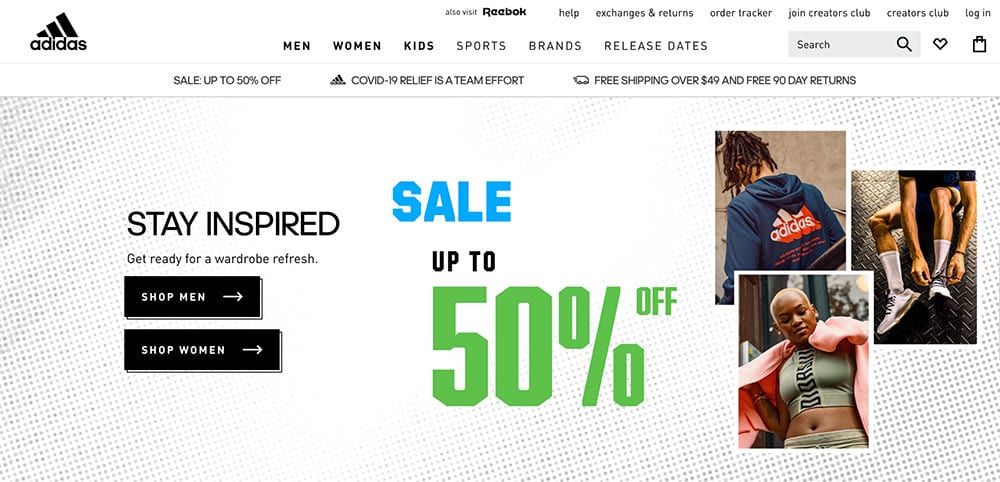
Some customers are attracted by free shipping — but almost everybody is interested in one kind of promo or another. Thus, discounts and exclusive deals are usually the first things that website visitors look for. Alluring promises and unique prices stimulate visitors to spend, spend, spend.
It makes sense to position eye-catching banners with discount offers on the upper part of the home page of an online store.
Free shipping is also a crowd favorite. You are now selling to the world (so to speak) at a larger scale, not just to the local market, so you should take the shipping costs into account. To save themselves from unwarranted shipping expenditures, many online stores usually adjust the minimum order price to include shipping costs.
As for the customers, purchasing from big retailers and online brand stores typically result in major, if not multiple purchases. Hence, the order price for free shipping is marginal and not a deterrent for these buyers.
Moreover, buying things on the Web even without the holiday deals may also be cheaper than in shops and boutiques — that’s why a minimum price limitation is acceptable.
3. Latest news and most popular products
When there is news, a sales period, or upcoming events that buyers should know about the product, the home page is the best place to house them.
Do not make it too hard for buyers to find exclusive deals and hot prices. Moreover, recurring customers will more likely look through several ‘new’ items on sale rather than spend half an hour browsing through the full inventory for something new and trendy.
4. Brand products
It’s not always possible to predict what the next customer will be looking for, but it doesn’t mean that you should place all your products directly on the home page.
What you can do is have the most eye-catching and interesting offers readily accessible. This trick makes a huge difference for retailers who have a huge product catalog.
If you have branded goods on sale, then display them upfront. It’s a great attention-grabber, especially with first-time visitors who don’t know what exactly they are looking for.
Moreover, there are many large retailers that provide an opportunity to ‘shop by brands’. Customers can find what they need through more targeted and effective channels like those practiced in the following websites.
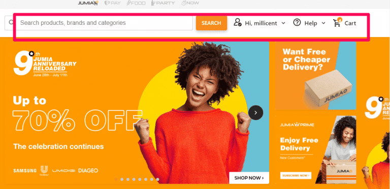
5. Shopping cart, login box and search box
The shopping cart, login box, and search box features are usually placed together at every eCommerce site. It’s almost impossible to imagine a store without a shopping-cart function included. The most popular shopping cart icon is a simple basket, so it makes sense to choose something similar to your site.
Many stores also provide their customers with private accounts where it’s possible to check all their previous and current orders.
Every customer who signs up can choose a personal login and password for further access. Besides, owners of such accounts can receive special discount offers from the store owners and participate in different promotions or sales.
If your online store offers a wide variety of SKUs, then the search box is a must-have. This will also prove popular with customers who demand a specific product that they just need to locate from your online store to make their order.
6. Payment Gateway Integrations
eCommerce websites deal with many customers from all over the world, and they each have their own preferred payment system. Moreover, there may be technical limitations to a payment method or option, and that’s why it would be better to clarify payment options in advance.
For instance, some eCommerce websites don’t accept international credit cards. Others require the customer billing address and the delivery address to be in the same country as the official store’s location.
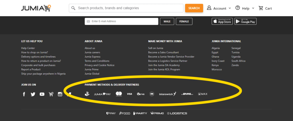
Online stores commonly use credit and debit cards, gift vouchers, cash on delivery, PayPal, etc. as their main payment system. You can easily find these payment icons at the footer or on the top right corner of sites.
7. Social media links
It’s said that almost 20% of online purchases are accomplished after surfing through social media sites. People are inclined to take in public opinion. Social media websites, such as Facebook and Instagram, are the best, if not fastest, source to get the info you need on just about everything.
Moreover, social media accounts bring excellent opportunities for self-promotion: online communities can help to identify the most active and influential customers or find new ones who are not familiar with the web store yet.
For online shops, it’s a good channel to keep customers abreast of the latest news, or special deals which are oriented towards Facebook or Twitter followers only.
8. Phone numbers and online chats
With online shopping, buyers interact with sellers via computer networks, making transactions that are no longer geographically bound. When there is a problem, however, customers would more likely prefer to have someone they can talk with.
This is the core of the need for a store support team; 24/7 hotlines and live chats are highly appreciated forms of value-added customer service.
If online purchases can be done all day and all night long, there is a need to provide 24-hours customer services to solve the majority of pre-sale and after-sale questions. Moreover, people can go online from their working places or home, so a purchase — and any accompanying inquiry — may come at any time of the day.
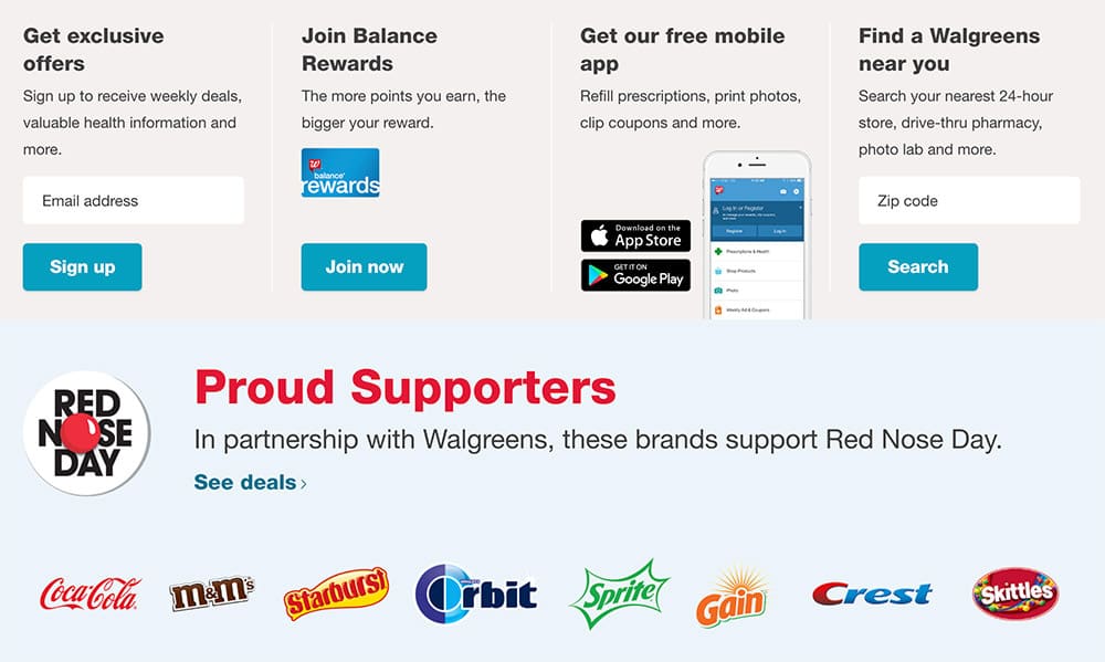
9. Store finder
A store finder tab is a must-have option for web stores that have several local or national retailers. Many conservative customers who prefer to check out the actual store itself may visit the website but only to find the nearest shop location or branch.
More likely, one will find this option on the top or bottom right corner of the site. If the store has a wide trade network, then it will be good to create a special store location search box for a country, city, zip code, or address search.
10. Trustmarks
Trustmarks are small images or logos that show a security guarantee by an external party, indicating that it is safe to shop on the site. Some of these trust marks come from Network solutions, McAfee, Verisign, BBB, TRUSTe, GeoTrust, etc. Such accreditation certificates give customers a sense of security and give them confidence in sharing their private information.
Visitors would be more inclined to make a purchase if they know that their payment details are safe from prying eyes.
It should also be noted that trustmarks don’t matter for big brand stores. They don’t need to pass security and privacy tests to confirm their reliability because they already have a good reputation.
Apart from trustmarks, a clear design, convenient menus, detailed product descriptions, and user reviews are also crucial for creating a better online reputation. Just note that trust plays a vital role in a customer’s willingness to part with their money.
Bonus: Include How-to guides
How-to’s are not obligatory. It is however a way to arouse visitors’ interest in purchasing something that they may not be familiar with.
For customers who are making major purchases, like a refrigerator or a new LCD TV, they would like guides or at least to know which specifications to look into before making a purchase.
This tab has nothing in common with the help desk, which usually answers technical questions and solve problems associated with a purchase.
Conclusion
We hope that the tips above will help make your online website the perfect go-to page for potential buyers. With all the time, effort and finances put in to generate your online presence, these minor suggestions may actually help make or break your business.
If you have other ideas that would be helpful, be sure to leave them in the comments section below.

